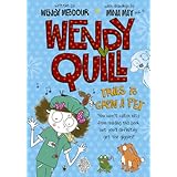
Front Cover :
The first thing I said when I picked up the book was "Wow! I love the illustrations," and they were by Mina May age 12! A-maz-ING. I can tell already that Wendy must have a love of animals because there's 6 on the front cover. A quote from the author says "You won't catch nits from reading this book but you'll definitely get the giggles." This implies that this book has humour in and every book should have some humour in.
Blurb :
The author and illustrator have really put effort into both the front cover and blurb. The blurb is very eye-catching, like the front cover, and the person who wrote the blurb makes it look like Wendy Quill has wrote it. Also it is simple but effective.
In my opinion these are the things that a good blurb and front cover should have/or should be.
- eye catching
- simple but effective
- no white spaces (unless necessary)
- big, bold title
- colourful
- pictures/drawings but not squished in together
Well the front cover and blurb have ALL these things so I have the feeling that this is going to be a good, enjoyable book.
Hopefully my review will be out soon.

No comments:
Post a Comment
Thanks for leaving a comment - they always make my day. But remember, no rude comments which will be deleted immediately.